Role
Designer
Researcher
Prototyper
Tools
Figma
Illustrator
Photoshop
LottieLabs
ChatGPT
Timeline
Sept 2024 - Apr 2025
Context
Kitchens are a fundamental part of every home, allowing users to cook food to feed themselves and their loved ones. Inspired by the story of my grandparents’ kitchen becoming less accessible to them as they aged, this project was undertaken to help create a solution for kitchen inaccessibility.
Problems
Kitchens that are fully accessible are unattainable for a large percentage of Canadians, especially Canadians with disabilities, as a renovation for an accessible kitchen can currently cost up to $30,000.
Every user has different needs and a different kitchen, therefore no one master solution is possible for kitchen accessibility.
Solution
AccessAble is a website that allows users to learn about a variety of easily-applied modifications and changes they can make to their kitchen. With the ability to filter by price, space, and ability, users are able to make their kitchen work for them, at their price.
Research
Honest stories help reveal users' struggles.
Through immersion into a variety of online communities dedicated to openly discussing topics from living with disabilities, to improving kitchen functionality in motor-homes, an extensive and ever-growing list of barriers that users may face in the kitchen was developed with the intent of finding and/or creating accessible solutions.
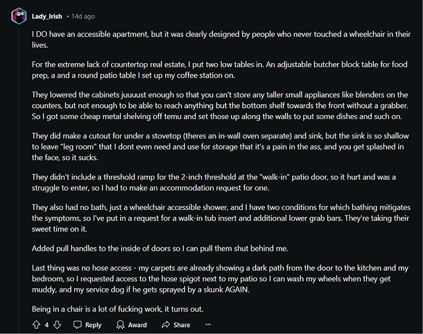
A post from r/wheelchairs from a wheelchair user giving dissatisfied honest feedback on the design of their “accessible” apartment.
Every user faces unique roadblocks and accessibility challenges in the kitchen
While each individual’s set of needs in their kitchen are unique, their needs can be broken down into broad categories.
Reduced Workload
When a kitchen or task requires a large amount of strength, time, or endurance from users.
Safety
When a kitchen or task presents risks to either users or users’ homes.
Space
When a kitchen is not large enough for users to complete tasks or maneuver in; Includes floor and workspace.
Organization
When a kitchen or the items/features in it are arranged in a way that hinders functionality.
Storage
When a kitchen does not have adequate room to keep all required items in it.
Reach
When features or items are at/in a height or area that makes it difficult for users to access them.
Grip
When items or controls are shaped in a way or made of a material that makes them difficult to hold or use.
Hearing
When tasks or tools require hearing in order to be done or used safely and effectively.
Vision
When tasks or tools require vision in order to be done or used safely and effectively.
Technology
When technology can be leveraged to improve the functionality or ease of use for any item, task, or feature.
Different roadblocks mean different solutions for every user.
Finding the right solution can depend on a number of factors unique to the user, such as budget, kitchen size, physical abilities, or even restrictions they may be under in their space, such as when renting a home; And because each user’s situation is so unique, only the user is truly able to know what will work best for them. Therefore a variety of solutions needed to be found and developed within this spectrum of factors so users could find a solution that works right for them.
Kitchen modifications that are DIY to at least some level are more cost effective.
Because price is a large factor that users have to consider, having options that are cost-effective is a necessity. DIY modifications, by nature, tend to be more cost effective, however they also require the user to have the skills, resources, and ability to complete the modification. This means that it is important for users to be able to see how accessible the actual modification process is.
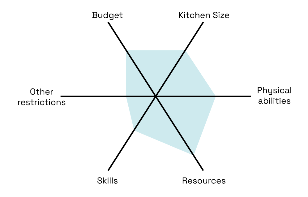
An example of the unique factors that a user may have to consider.
The solution's UX needs to allow the users to search, filter, learn, and follow instructions.
Because there is no existing model that covers all these factors, a custom UX was created by combining features and aspects from instructional videos, instruction manuals, catalogues, guide books, and eCommerce sites.
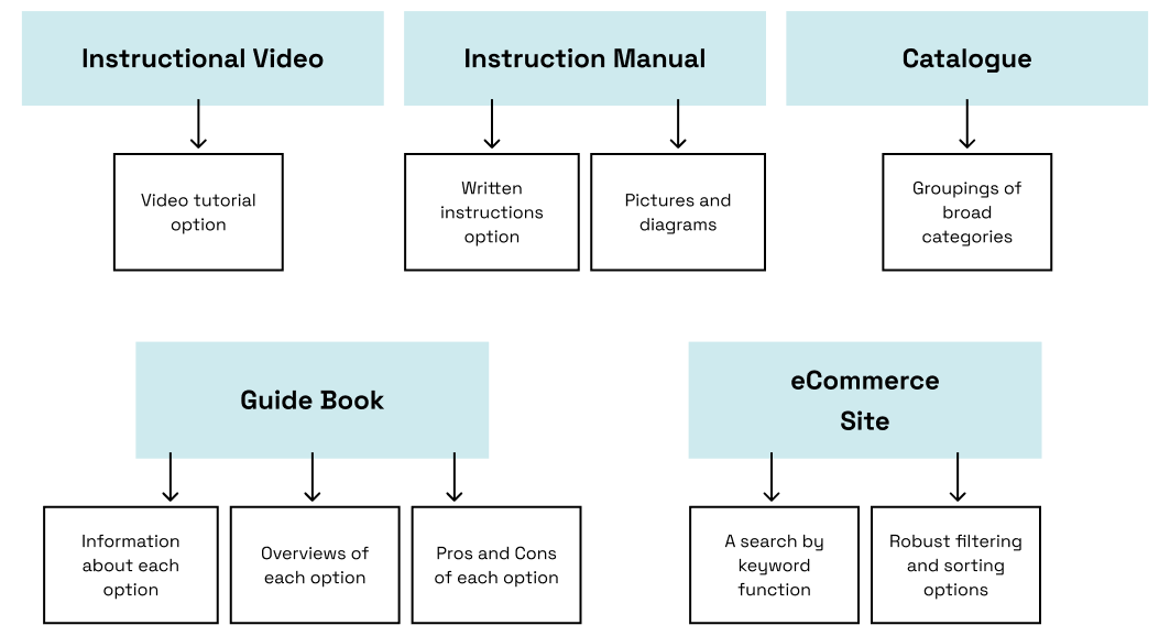
The features and aspects taken from each model to be used in the solution.
Development + Testing
Limiting UX to core pages keeps the user flow simple and intuitive.
Having too many pages and ways to find information creates an unnecessarily complex user flow that makes it harder for users to find what they are looking for. Therefore, the requirements set of searching, filtering, and accessing information and instructions should be met in as few pages as possible without putting too much on one page.
This can be met with:
- A homepage with a search bar and categories options
- A search results page that allows users to enable a variety of filters
- One page per modification that displays all the information and instructions relevant.
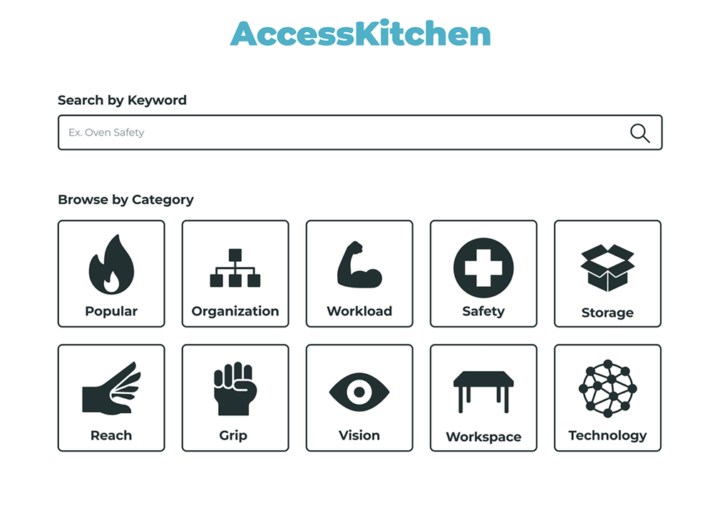
Home page with search function and categories listed from the early prototype of AccessAble
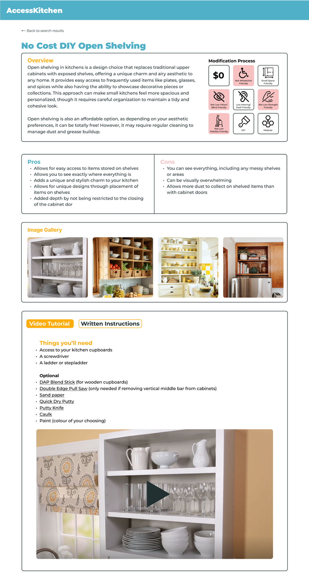
Modification article with all relevant information and instructions from the early prototype of AccessAble
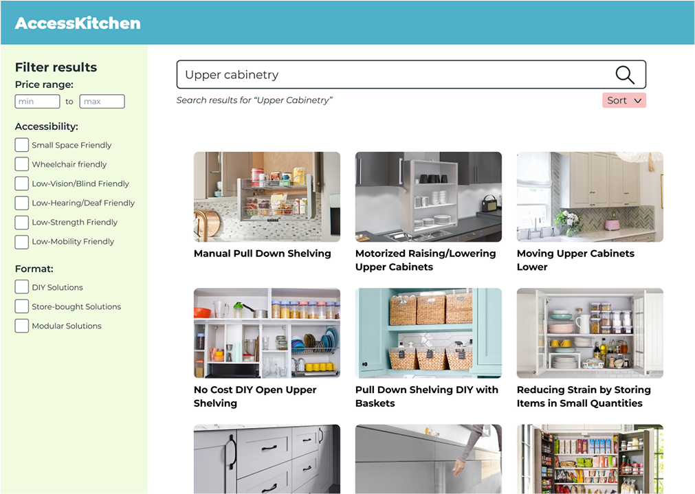
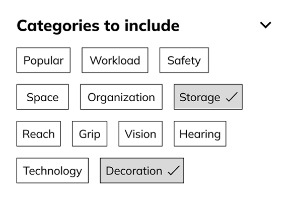
Search results page with filtering capability from the early prototype of AccessAble
Users prefer simple and predictable functionality over innovations in design.
User testing revealed that above all else, including interesting visual design and innovation, users want functionality to be simple, predictable, and to support the information on a page. This insight was shown through the consistent preference to the simpler versions of the prototype that were tested, versus versions that included uncommon, but still understandable, UI elements.
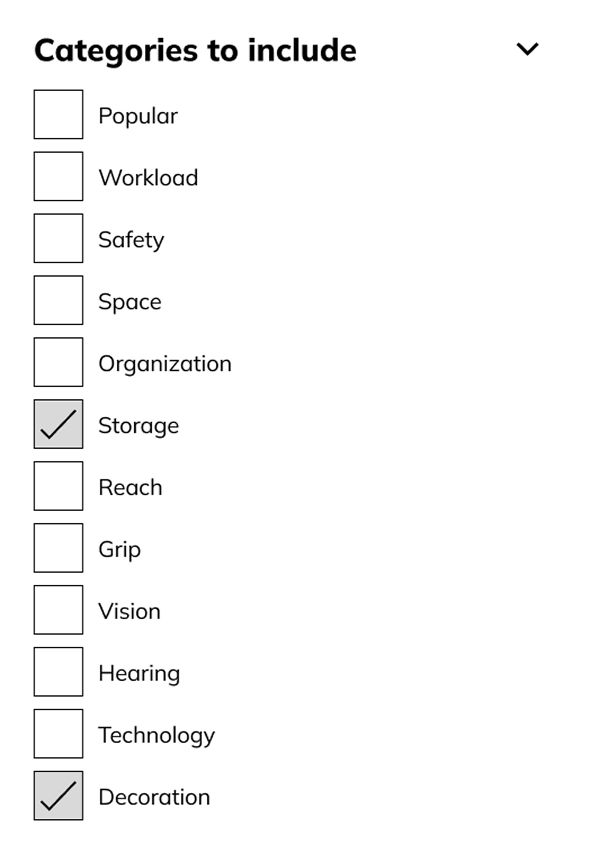
Two different UI options for a filter by category feature. Users preferred the simplicity and predictability of the version on the left (checklist), rather than the version on the right (tiles) even though the left version uses significantly more space, and caused the users to have to scroll.
Synthesis
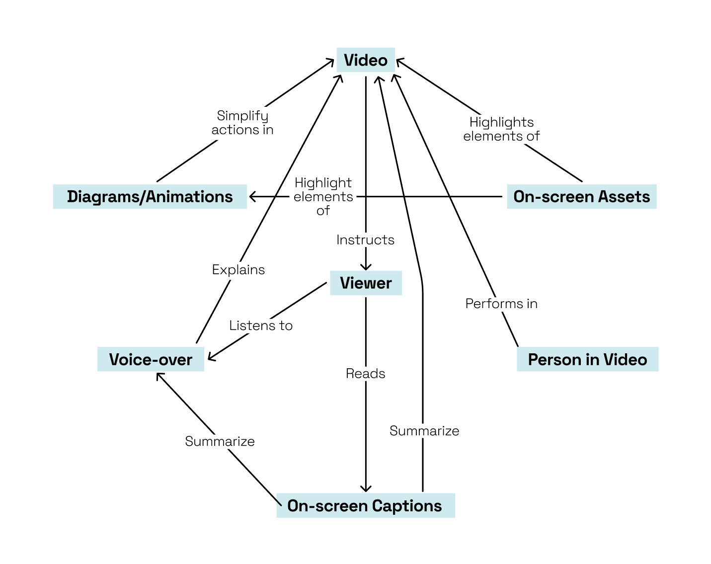
For users to be able to make informed decisions, modification pages must present information in a structured and consistent way that supports learning.
Information systems that outlined how elements of the instructions work together were developed for the written instructions and video tutorials that are included in each modification article.
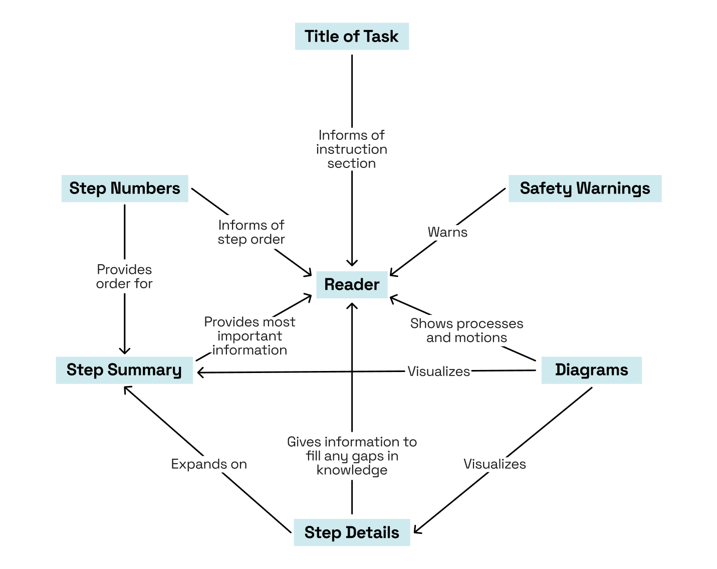
System for how elements of the written instructions work together.
System for how elements of the video tutorials work together.
Visual design and branding should convey friendliness, ease, and overall accessibility.
A limited colour palette of light and dark blue and green was chosen due to the colours’ connotations with reliability and success, as well as also being used in the International Symbol of Access.
The logo reads “accessAble” in an accessible typeface and contains an upward arrow in negative space to symbolize upgrading and improving.
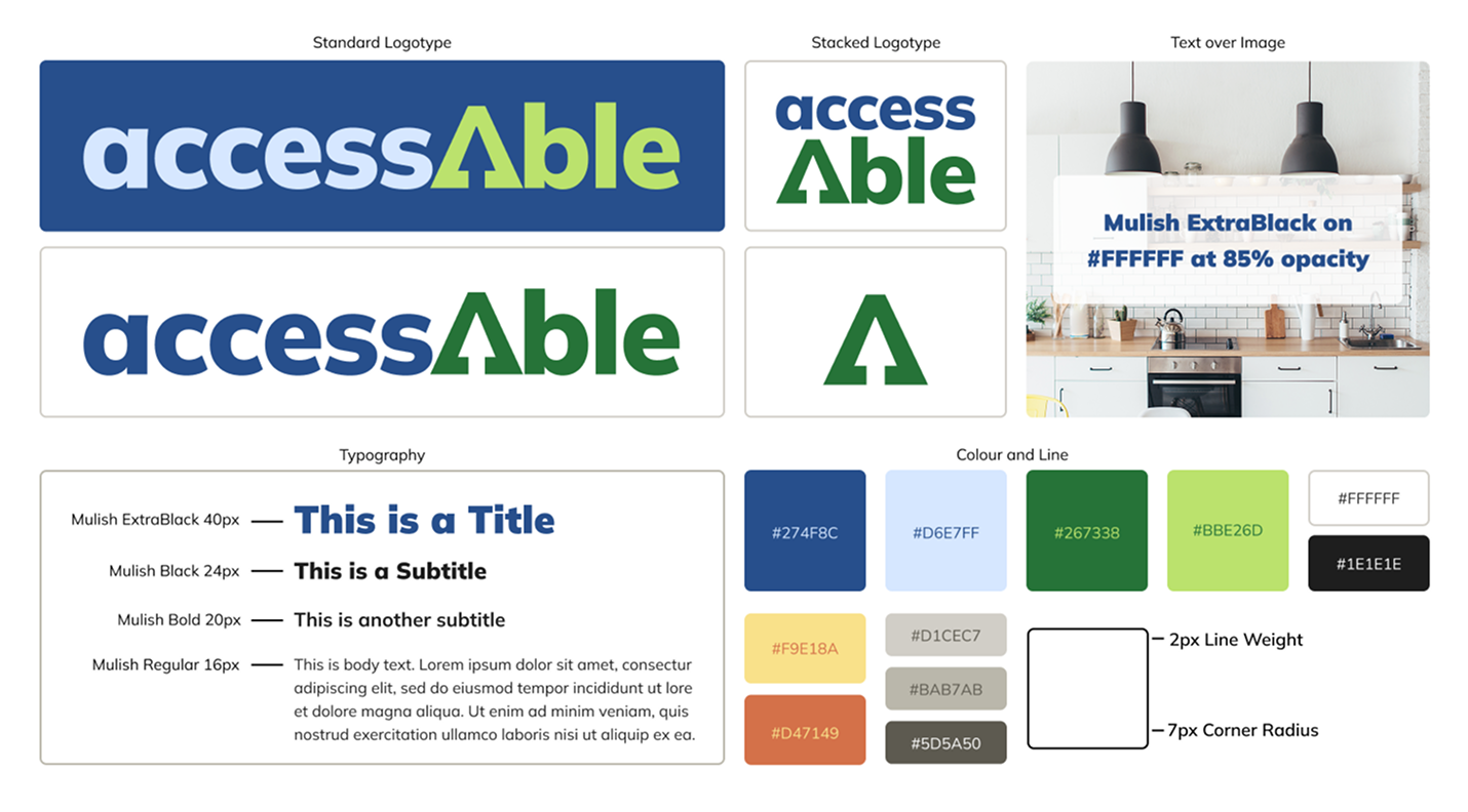
Simple branding guidelines showing the AccessAble logos, colours, type and line treatment.
Final Design
A possible journey for a user.
List of Modifications
Technology
- Motion sensor lights
- Hand clap lights
- Motion sensor trash cans
- Automatic can opener
- Smart ovens, microwaves, rice cookers, etc. that respond to voice commands
Visual Contrast
- Use clean, simple lines to reduce visual clutter
- Matte tile for durability, non-slip, and visual contrast purposes
- Changing floors
- Changing backsplash
- Changing walls (painting)
- High contrast tools and items
Lowered Workspace
- Moveable island
- Motorized raising/lowering countertops
- Separate height countertops
- Mirror under cabinet to see higher counters
- DIY flip-up board
Appliances
- Switching to a wall oven
- Using induction stovetop
- Moving sink controls to side
- Air fryer
- A portable hot plate
- Choosing appliances that have more than one sensory option for use
Reach
- Pull-down shelving inserts
- Motorized raising/lowering cupboards
- Pull-up appliance shelves
- Buying pull-out shelving
- Open shelving
- Lowering power outlets
- Removing lower storage for wheelchair access
- Modifying existing shelving with brackets to make them pull-out
- Lowering a wall-hung sink
- Only keeping a few plates/cutlery at a lower height
- Open space/seating under island
- Replacing appliances to have barn doors
Storage/Space
- Pans/pots with detachable/folding handles
- Rotating spice rack
- Decanting items
- Getting rid of furniture/items that are not being used
- Using inserts on the inside of cupboard doors
Workload
- Trolley for moving heavy items
- Re-organizing the kitchen to fit workflow
- Grab bars
- Buy items in smaller sizes to reduce weight
- Asking a neighbour/friend to install something
- Hiring a company to install something
- Using light dishware
- Reorganize kitchen to make sense with the workflow of the user
Grip
- ADLA Grabber
- D-shaped cupboard handles
- Push-to-open cupboards and doors
- Rubber gripper
Safety
- First aid kit
- Mandoline Slicer
- Securing any tripping hazards
- Using durable dishware
- No rugs/mats/anything that is not flat to the floor
- Rounded countertop edges
- Ensuring there is open space beneath heating appliances to place hot items
Organization
- Baskets on shelves
- Organization inserts
- Keeping each item in its own specific spot
- Labelling each item with a neat, printed sticker
- Labelling each item with braille
Identification
- Carving certain numbers of notches into items
- Tap Tap See app
- Getting appliances with physical buttons
- Adding bump dots to non-physical buttons
General
- Contact local agency on aging for information or free products
- Using all your senses in the kitchen to identify items and activities